
Hello beauties!
Natasha Denona Cranberry Palette is one of their new releases for Holiday 2018. I do like her eyeshadows, blushes and highlighters but I have to admit she went a little overboard with the launches in my opinion this season.
She was actually launching one palette after another, but the good thing is that a variety of choices now in terms of colors. I don’t know if your wallet will feel the same though. For me Natasha Denona Cranberry Palette was something that called my name right from the start. Well you know me, pinkish girl, feeling good wearing pink and purple makeup so this palette was just my speed.
Availability
U.S. Launch Date – Now in stores at Sephora | 25 October 2018 at Sephora (online) and Beautylish
Natasha Denona Cranberry Palette Review
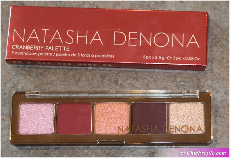
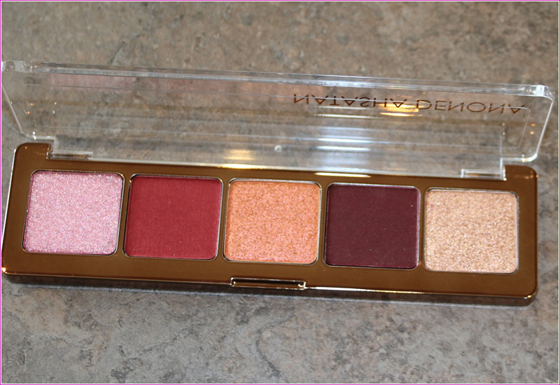
Being among the first who posted a sneak peek of the Cranberry Palette ($48.00 / 5 x 2.5 g / 0.08 oz) , I was quite curious to see the official swatches. The palette is a limited edition, special release for Holiday 2018 season.
The first thing that made me get this palette was the color combination. I know Natasha Denona Gold Palette was on the way too but that’s just not among my preferences. Then again you have another holiday 2018 release, the Mini Star Natasha Denona Palette if you feel more love for those shades.
Let’s get back to our palette right here which features 4 New shades and one repromote shade which is Nude. You’ll find this versatile, universal shade was released as part of holiday 2017 collection featured in Aeris Mini Palette.
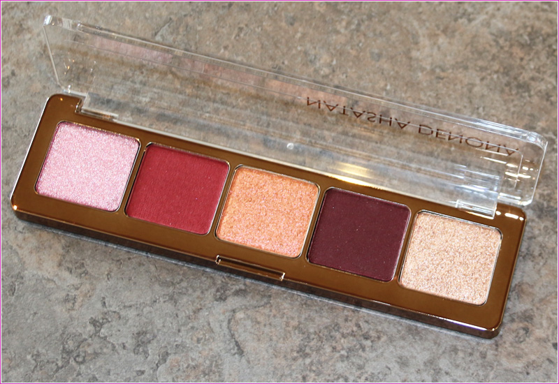
There are 4 cream powders and one pressed powder which is the shade Botanic in the middle. You’ll also get 3 different finishes: crystal metallic, matte and duo chrome.
What I have to mention right from the start before I’ll get into shade by shade review is that I find her official swatches to be deceiving. I’ll post live swatches on Instagram as well so make sure you are following me. Don’t forget to check out my #igtv because probably I’ll upload the full video there. You can write me your opinions and comment on the difference.
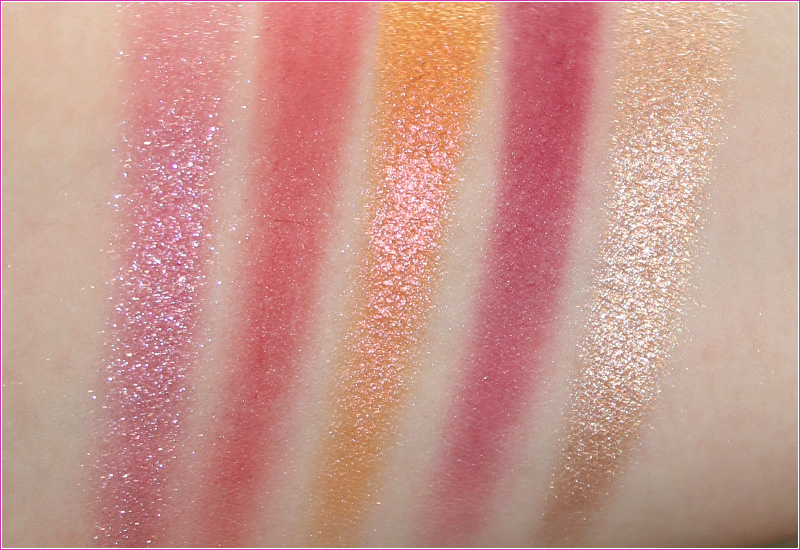
The swatches you’ll see in the photos bellow were taken on bare skin and in a single swipe. I haven’t applied any eyeshadow primer or makeup base prior swatching these shades because I wanted to give you their real pigmentation and color payoff.
Natasha Denona Cranberry Palette Packaging
It comes in the same packaging as the rest of Natasha Denona Mini Palettes with a small difference. The Cranberry Palette looks a little bit more luxurious due to the gold lining, just like the previous holiday 2017 palettes had.
On the back it has 5 little dots that allows you to depot the eyeshadows easily. I’m pretty sure I’ll keep my palette the way it is, but it is very useful to know that you can easily depot them and create your own customized palette.
It will be very easy to makeup artist to pop all these 5 shadows into a bigger palette along with the other mini palettes Natasha has.
Natasha Denona Cranberry Palette Shade by Shade Review
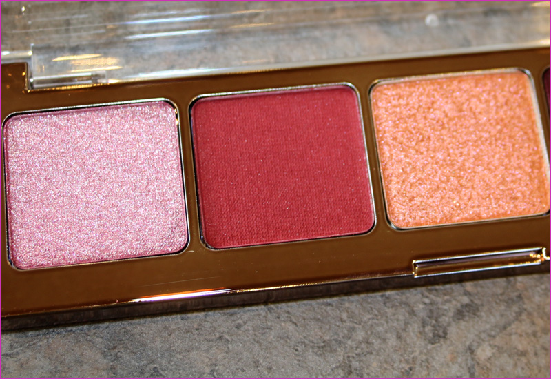
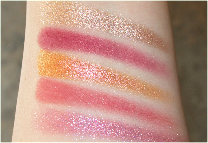
Daisy (190CK) Eyeshadow is a light pink-lilac with cool undertones, shimmer particles and a crystal metallic finish. It has a semi-sheer color coverage applying well onto the lid. Adheres well onto the lid and has no fall out during the application. Is one of the new shades.
It’s a beautiful shade but is not as pigmented as I would expect or how it looked in her official swatches. It it’s easily blendable but I find it to apply better with my finger or a dampened brush.
The finish is very smooth and soft to the touch. The glitter particles have a silvery touch so it looks very luminous and bright on the lid. You get very smooth and fine shimmer particles that don’t feel or look chunky at all. I personally do love this shade, even though is on the sheer side. You can get more pigmentation if you layer the color and make sure to use a base.
This shade wore well on me for about 8 and a half hours without any creasing or fall out.
Sakura (191CP) Eyeshadow is a medium reddish-pink with a satin matte finish. The formula is cream powder, that feels very smooth and velvety to the touch. The color payoff is not that great in my opinion. In one swipe you’ll get a sheer color, easily buildable to a semi-sheer finish. It does blend easily but it tends to sheer out the more you blend it.
I had no fall out during the application as it adheres well onto the skin. The finish is not a true matte I’d say, as it feels more like a satin matte but does look matte when you apply it. It’s like a softer matte version, more forgiving.
The application went fairly OK, I’d say. It’s not buildable to an opaque coverage so even though I tried layering it, I couldn’t build up the color. It doesn’t look patchy at all, for me it’s just like a transition color.
I got around 7 and a half hours wear before this color started to easily diminish its intensity. I might say that this shade is a bit deceiving at it doesn’t look on the lid like it looks on the pan. It’s a big difference, because it pan it looks more dark and intense and when you apply it turns to a pinkish shade.
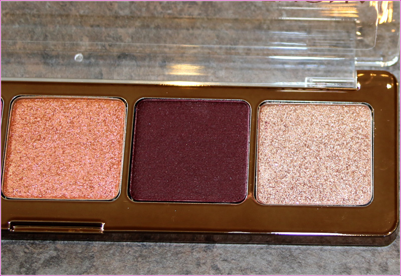
Botanic (192M) Eyeshadow is light coppery-orange with warm undertones and a duo chrome finish. It’s a pressed powder and feels creamy to the touch. It has a good color payoff with an intense shine.
This color applies best if you use your finger. I tried a dampened brush but goes on a bit sheer while by using my finger I get more pigmentation. If you use a brush it will apply more chunky and you’ll get some fall out. By using my finger to apply this color I get a smoother finish and no fall out.
The color is beautiful, makes your entire makeup pop and gives you a bit of intensity. I got around 8 hours wear with this color.
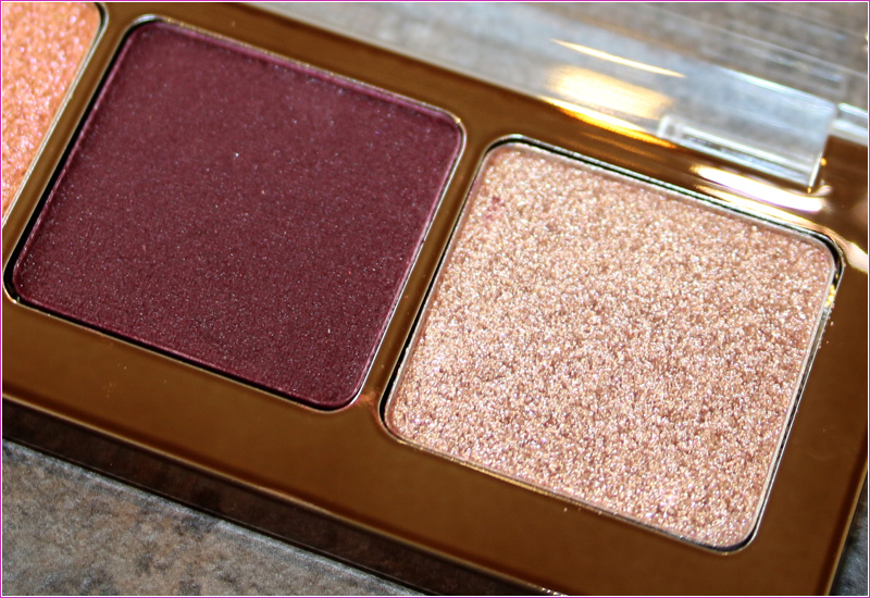
Blossom (193CP) Eyeshadow is a medium dark cranberry with a purple touch and a matte finish. It does comes on matte on the eyes but is more of a satin matte. The color in the pan is not true to what you’ll get on the lid. In the pan it looks definitely more darker, intense and as a purple. While on the lid you don’t get that intensity and pigmentation as it applies on sheer, maximum buildable to semi-sheer.
I was a bit disappointed not to get that plum shade when I swatch it and be drawn more to a cranberry shade. I’m not saying the color is not beautiful as it actually complements really well the others shades in the palette. I’m just saying what you see is not what you get. That’s why I think posting live swatches tomorrow on my Instagram will show you exactly what I’m talking about.
I like the super smooth finish and how well it applies but I would have definitely expected more pigmentation. It blends easily, without any fall-out but it’s prone to sheer out when blended.
I got around 8 hours wear with this formula without any fall out or looking patchy.
Nude (140CP) Eyeshadow is a medium-dark peachy with warm, rosy undertones and a crystal metallic finish. It has a semi-opaque coverage and it’s easily buildable. This is the only repromote shade in the palette, also included in the Aeris Mini Palette.
This is a flattering, universal shade that goes well on anyone and complements any skin tone. The consistency is soft while the formula is cream powder. If I apply it dry it tends to sheer out and has a bit of fall-out during the application. I like to apply it best with my finger or a dampened brush. You can also use a glitter adhesive to make this color really pop.
In the makeup look shown bellowed I just used Urban Decay Eyeshadow Primer Potion but I’ll definitely post more looks in the upcoming days. On me this shade lasted for almost eight hours on me.
Natasha Denona Cranberry Palette Makeup Look
The other day I created a look using Natasha Denona Cranberry Palette so you can check more photos on my Instagram. You can easily see how well the colors look together but they are not very pigmented. Not even the darker shade is as intense as it looks in the pan.
Enjoy more photos…

1 comment
Thank your for your very honest review Tavia. I also think the swatches are not quite the same as those shades in the pan either. And it is disappointing when the product is less pigmented than what you thought. The plum shade, my favourite, was really more reddish.