Hello sweeties!
I know my review of Anastasia Beverly Hills Riviera Palette is so overdue as this palette launched back in March. I actually did a preview post back then when I purchased ABH Riviera Eyeshadow Palette along with a FREE GIFT Set and more ABH products from CultBeauty.
The truth is, that I’ve been using this palette quite a lot for the past few months and I’ve been dragging this review because I was undecided about the performance of some of the shades. As I’m always reviewing each shade of the palettes individually I wanted to take my time with this palette.
U.S. / UK – Now at SEPHORA, ULTA, Beautylish, BeautyBay, Selfridges, Dillards, Cult Beauty

ABH Riviera Palette Review
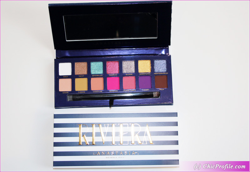
Anastasia Beverly Hills Riviera Eyeshadow Palette ($45.00 / £46.00 / €50.00 for 0.28 oz.) is a new and limited edition palette that features 14 shades. For me this truly looks like a Summer Eyeshadow Palette because of the color combination of brights with warm neutrals.
There are also a lot of finishes to work with, between shimmers, mattes and satin. Overall I feel the palette has a good variety of finishes and colors to work with, blend and use as transition colors but also to make your makeup pop and add a bit of sparkle if you wish.
Only when the weather here gets better and the summer approaches I tend to be bold in my makeup routine and choose a palette like this with pigmented and bright shades.
I just quickly want to mention that we have 3 Pressed Pigments in this palette: Bahamas, Cannes and Palm which are not intended for use around the immediate eye area. I will talk more details bellow under Shade by Shade Review Section.
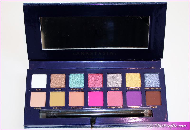
ABH Riviera Palette Shade by Shade Review
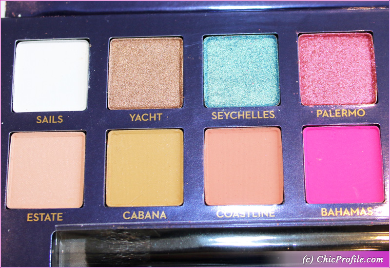
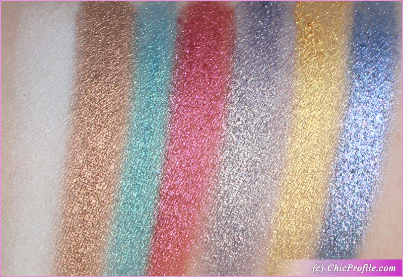
Sails is a white with cool undertones and a matte finish. It had a good pigmentation, almost opaque in a single layer and on bare skin. The texture was a bit powdery, therefore it gave me some fall out during the application. I got around seven and a half hours wear.
Yacht is a medium, golden bronze with warm undertones and a shiny finish. It had almost an opaque coverage with a great color payoff in a single layer. The texture was very smooth and felt quite creamy and silky to the touch. It adheres well on bare skin and blends out easily without any fall out during the application. I got around eight and half hours wear with this formula.
Seychelles is a light-medium, turquoise with cool, blue undertones and a metallic sheen. It had good pigmentation in a single layer on bare skin with no fall out. In just two layers the color was build up to full coverage with a smooth and creamy consistency that glided smoothly across the lid. On me it wore well for almost nine hours.
Palermo is a bright, medium rosy-plum with warm undertones and violet shimmer and micro-sparkle. It had good color coverage in a single layer applied on bare skin but it took two layers to get full opacity. This shade works beautifully applied with a dampened brush as it will give more pigmentation and no fall out during the application. The consistency was smooth but slightly looser. It lasted on me for about eight hours.
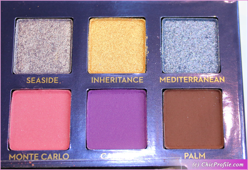
Seaside is a pale, silver-lavender with cool undertones and a gold sparkle and shimmer. It had an excellent color payoff with opaque pigmentation. The texture is loosely-pressed so it’s prone to fall out during the application. The best way to apply this eyeshadow is by using a dampened brush and just pat it on the lid gently. I noticed it tends to sheer out when I blended it so it’s best to press it in. I got near to 8 hours wear before it started to fade and crease easily.
Inheritance is a bright, golden yellow with warm undertones, sparkles and metallic finish. It had a good pigmentation which turned fully opaque when applied with a dampened brush. The consistency is loosely-pressed but it felt soft to the touch. It may give you fall out during the application so make sure to pat and press it in rather then blending it out too much. I had a little over 8 hours wear before creasing and fading slightly.
Mediterranean is a light, aquatic-blue with cool undertones and a sparkling, metallic finish. In a single layer it was semi-opaque but it was easily buildable to full opacity in a second layer. The consistency was creamy but it felt chunkier in the pan than the previous two colors.
I recommend to use the same technique for applying this shade, with a dampened brush and gentle pat and press motions. Applying this shade with a dry brush it will give you noticeable fall out. I do love the beautiful metallic finish and sparkles that make this color really pop and intensify your makeup look. It took me close to eight hours wear before it started to fade.
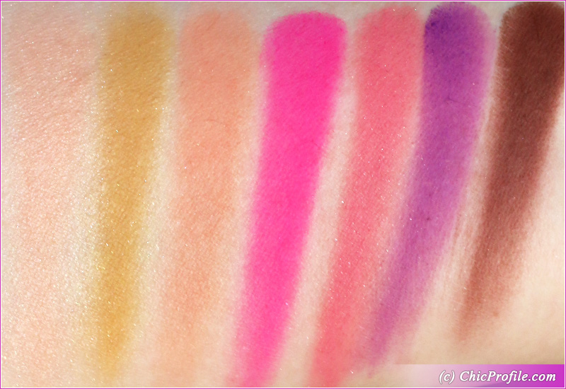
Estate is a light peach with warm orange undertones and a matte-satin finish. It looked semi-opaque in a single layer, while the ultra-fine shimmer was noticeable when applied on the lid rather than swatched on my hand. The texture felt a bit powdery but it was easily blendable without sheering out. I got around seven and a half hours with this shade without any fall out.
Cabana is a medium, mustard-yellow with warm undertones and a matte finish. It had an opaque coverage in a single layer applied on bare skin. The texture was soft but slightly powder which gave a bit of fall-out during the application. It blends easily and doesn’t sheer out. On me it wore well for about 8 and a half hours before fading.
Coastline is a medium peach with warm undertones and a matte finish. It had a good pigmentation in a single layer and adheres well on bare skin. The texture felt moderately between soft and dry and blended out easily. It lasted well on me for over seven hours without any fall out.
Bahamas is a bright fuchsia with cool, blue undertones and a matte finish. This color is so intense and beautiful that I could name it among my favorites easily. The texture is smooth, without any sign of dryness but it kicks off a little powder in the pan.
The downsize of this shade is that being a pressed pigment is not intended to be used around the immediate eye because it will stain heavily. I do mean some serious staining that will be visible not only for a few hours after I removed my makeup, but to the next day as well. It blends beautifully and easily and lasted on me for nine hours as a bright shade.
Monte Carlo is a peachy-pink with warm undertones and a soft matte finish. It was well pigmented delivering almost an opaque coverage in a single layer. The texture is smooth, soft and easily blendable but it kicks off some powder in the pan. Just be careful when applying this shade (use a dampened brush) and try to pat it on so you can avoid any fall out. I got around eight hours of good wear.
Cannes is an intense, bright purple with subtle, warm undertones and a matte finish. This was quite a tricky shade to blend and work with, even though for me it looks so beautifully in the pan. The texture is problematic even though it feels soft, it’s quite powdery and applies very difficult. It tends to look patchy on some areas, doesn’t apply evenly so it takes a while to blend it. I would apply it with a light hand and take my time to really blend the edges. This shade left a stain behind, just like Bahamas did but it lasted well on me for around 9 hours.
Palm is a deep-dark, reddish-brown with soft warm undertones and a matte finish. It had opaque pigmentation in a single layer and adhered beautifully on bare skin as well. It had a soft texture that worked easily across the skin when blended and didn’t gave me such a hard time compared to the other two Pressed Pigments.
This shade was the best performing one compared to the other 2 Pressed Pigments (Bahamas & Cannes). It didn’t stain which really impressed me and it was easily to apply it and work with. I also got over eight hours wear from it.
ABH Riviera Palette Swatches
I swatched all these eyeshadows on bare skin, applying each color in two layers.
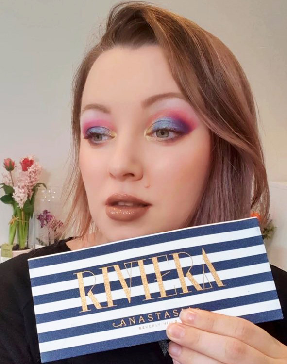
ABH Riviera Palette Makeup Look
This is the first look that I’ve created with ABH Riviera Eyeshadow Palette. I wanted to use as many colors from the palette as I could to see how they will blend together and how they will perform.
I admit I wasn’t so inspired when it came to the lipstick color and right after I took the photo I wanted to apply a brighter and more intense color. 🙂